
Investments section redesign
UI design and front-end development to simplify a complex experience and improve understanding of investment products.
UI design and front-end development to simplify a complex experience and improve understanding of investment products.
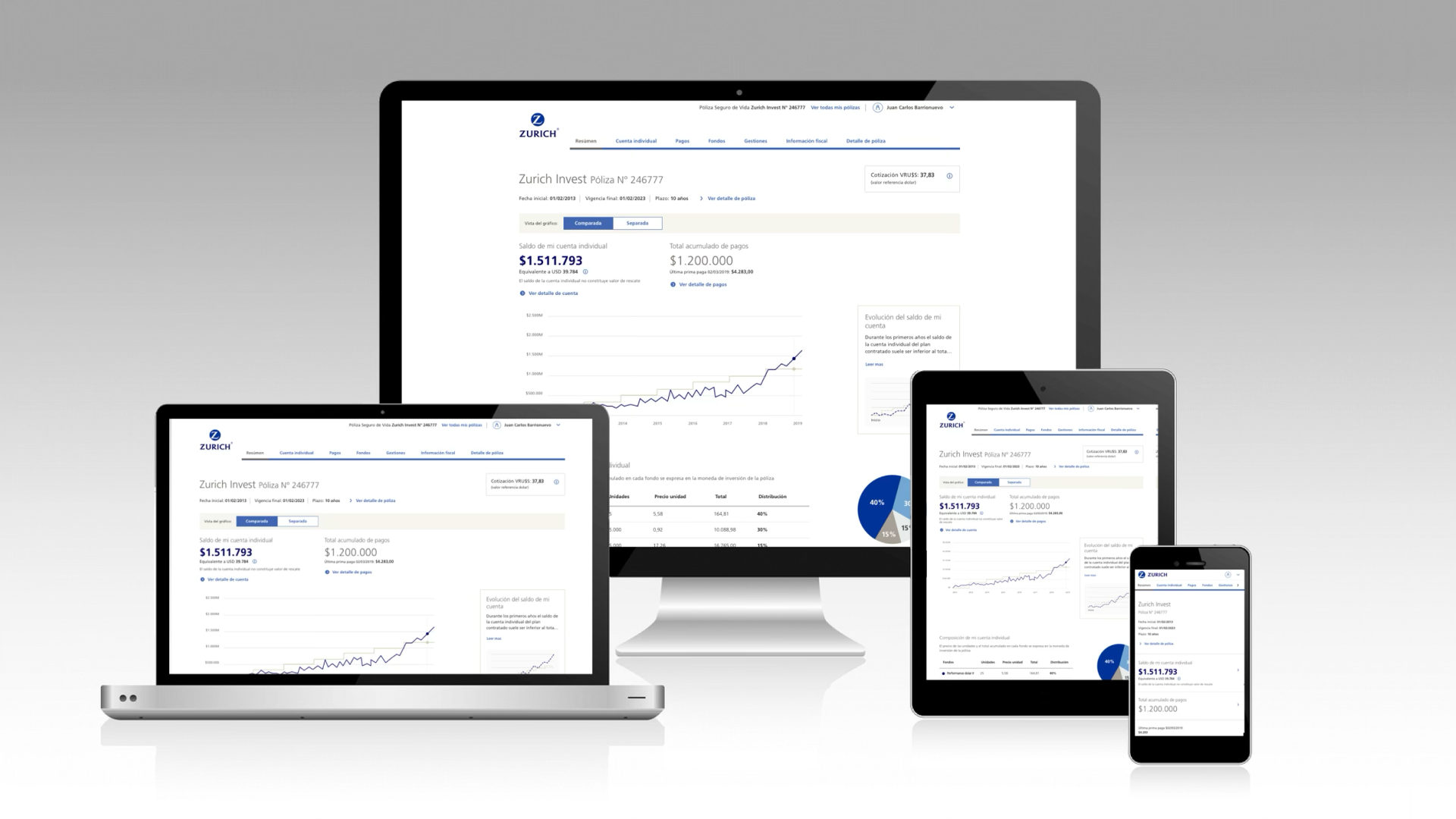
Zurich offered a range of investment products within its digital ecosystem.
However, the section had comprehension problems, making it hard for users to understand the available alternatives and make informed decisions.
The main problem wasn't usability, but the lack of information needed to make decisions.
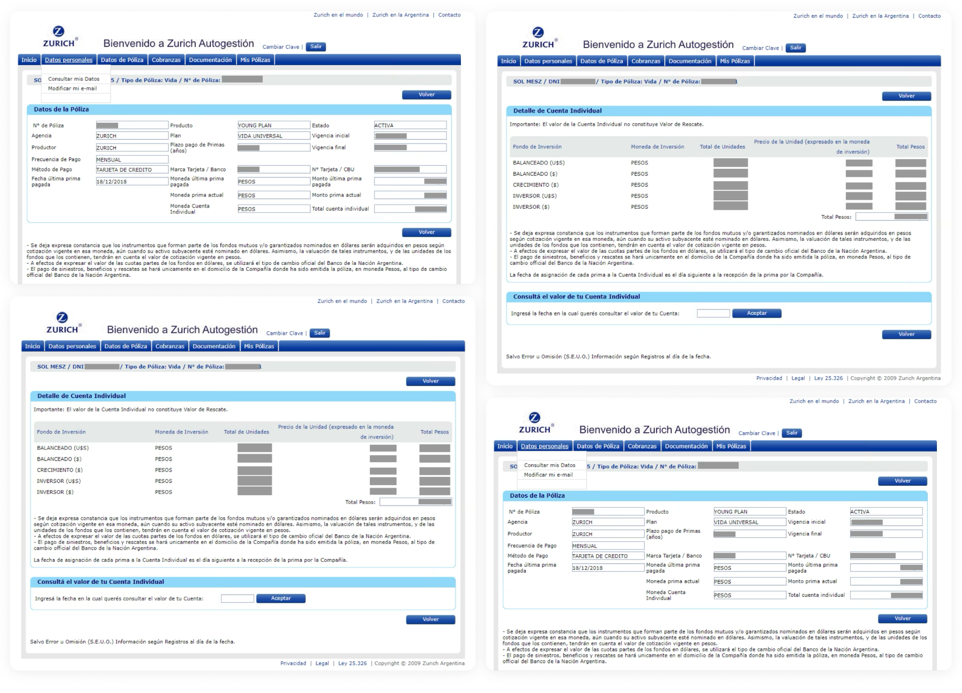
I joined the project once the initial research and a first architecture had already been defined.
My job was to take that foundation to a clear, usable, testable final experience, focusing on the interface, information hierarchy, and the functional prototype.
The new experience reorganizes information around decision-making:
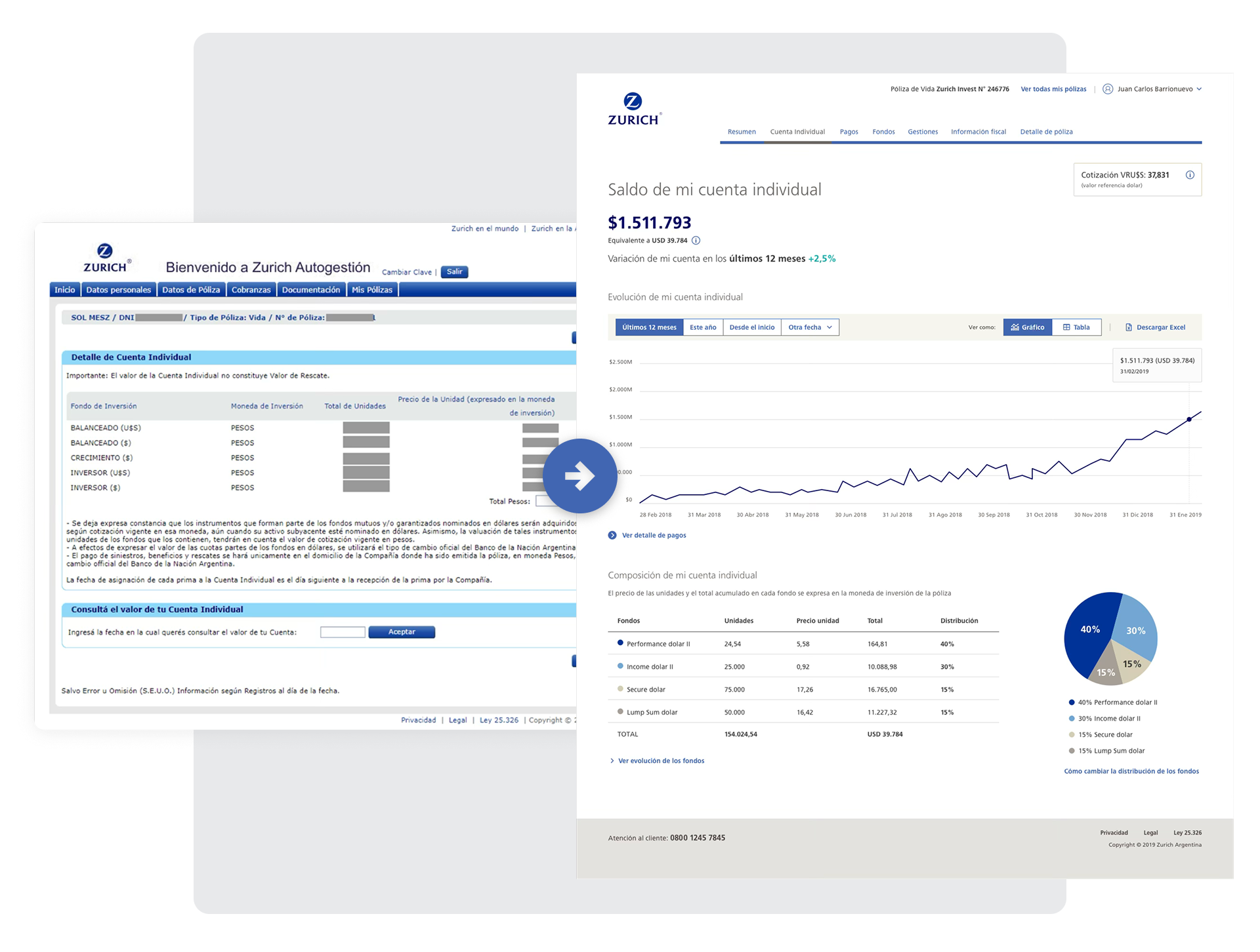
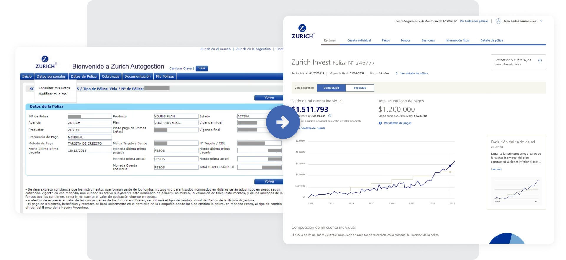
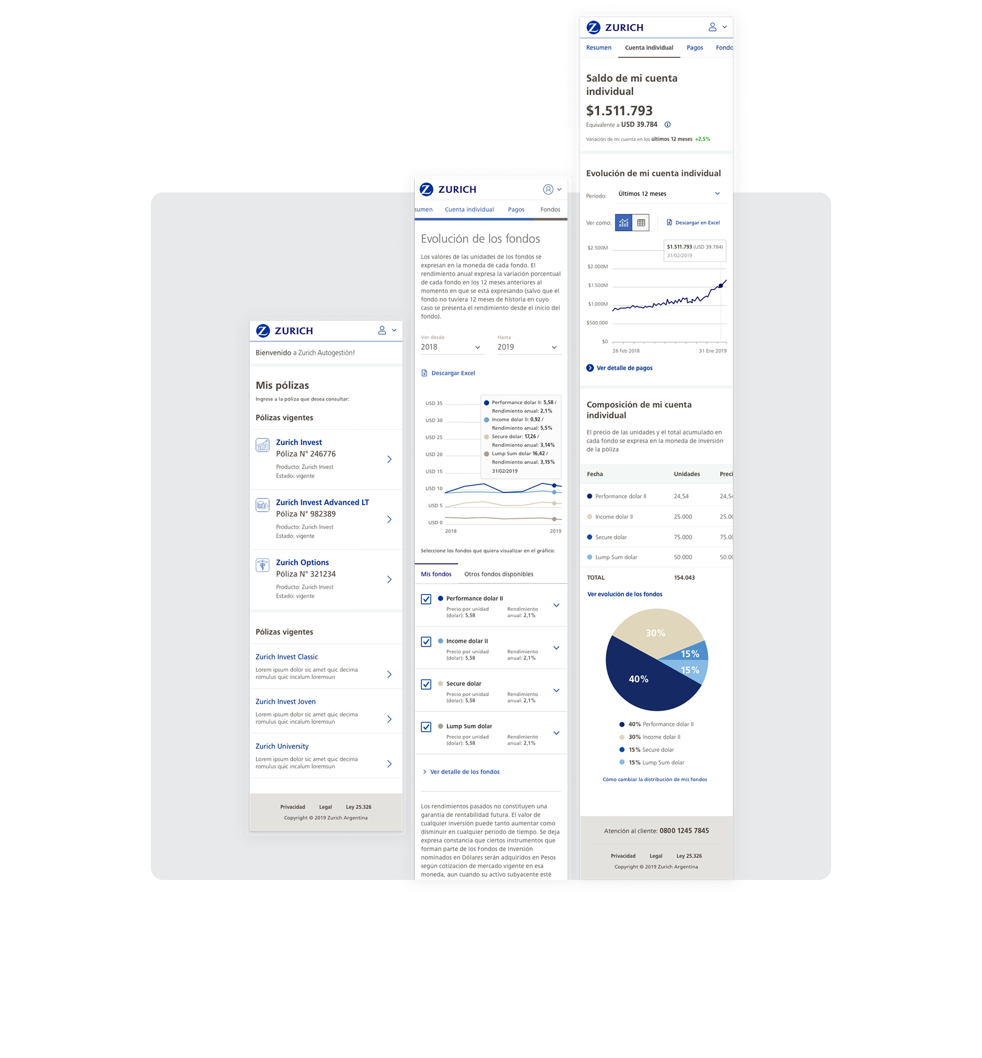
The final round of user testing was done with an HTML mockup, since the different features and the dynamic chart evaluation couldn't be done with traditional tools like InVision or Figma.
This made it possible to properly validate:
The new design and user testing produced the following results: